NASA Augmented Reality
Summary
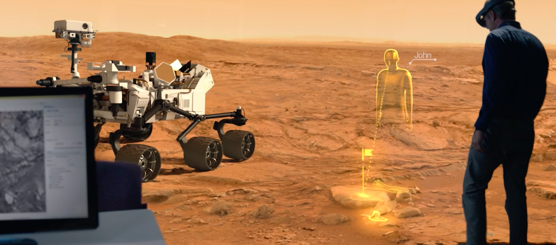
This NASA collaboration project was for a Capstone course in Human Centered Design and Engineering at the University of Washington. Currently the global teams of scientists, engineers and mission planners lack a good tool for communicating mission plans. The ability of AR allows NASA mission support from around the world to connect virtually in the same room as mission command. Our final submission was based around providing a deliverable that would show off AR's ability to collaborate efficiently with mission teams.
My Role
I was the product designer where I developed the UX/UI for the HUD & I produced and created the video prototype shown above using VFX and Adobe tools.
User Research
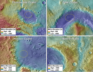
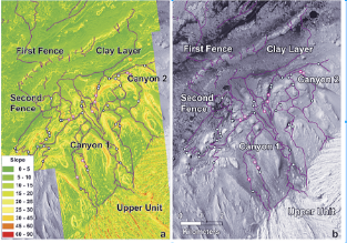
The team conducted secondary literature reviews to determine whether VR or AR would better suit the JPL design space, and to review the mission plans from the last Mars Rover expedition for important or applicable Rover information. Existing mixed reality applications in the market were also researched to determine if any applications had previously used geographic information systems. Existing applications served as ideas and inspiration for what could be accomplished in the 3D medium.
Virtual reality allows for a completely immersive experience, whereas in augmented reality the user can still interact with the real world. Augmented reality finger movements and eye tracking are less precise than virtual reality controller inputs. Augmented reality is more useful for collaboration between teams. These findings were kept in mind during the ideation phase to ensure that our application was designed for the correct medium.
Existing Tools
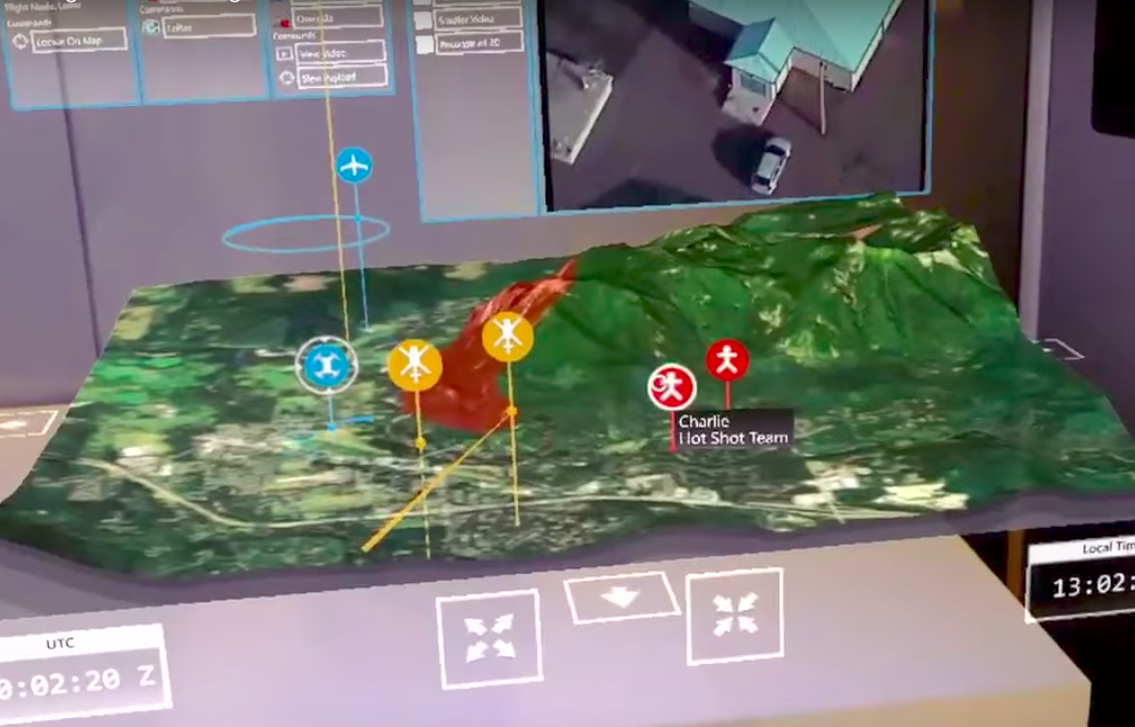
Existing applications that use geographic information in 3D include Google Earth VR, which provides complete immersion of and allows users to zoom in or out to visit any area on earth. Of particular interest was also a Boeing application in augmented reality used to control and dispatch UAVs to fight wildfires. The topographic map in particular served as inspiration for how 3D space could be used to enhance geographic information.
Workflow at the Jet Propulsion Laboratory
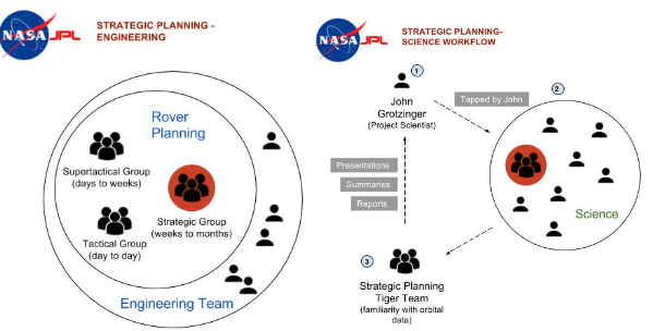
Two main departments determine Rover operations at JPL: Scientists and Engineers. Each have their own Strategic Planners that work together to form a plan for the Rover based on what is scientifically interesting versus what is feasible with engineering. The engineering Strategic Planners work only on long-term missions ops, while in Science, small Tiger Teams are chosen to lead specific Strategic Planning efforts.
Current Technology and Tools
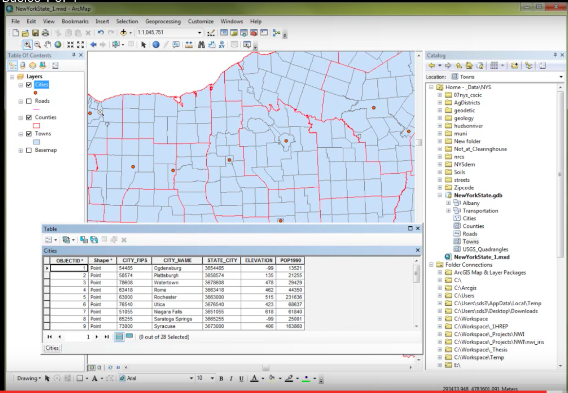
JPL Scientists and Engineers mainly use a software called ARCGis for Rover path planning and scientific analysis. Different geographic “layers” can be added and turned on/off for viewing. NASA scientists also use Adobe graphics programs to create geographic interpretations presented to other scientists. However not everyone has access to these programs and collaboration can be difficult.
Design Solution
Between the final few designs selected, the team chose to proceed with the storytelling idea. The primary tie-breaker was the team’s preference to work in 3D. This design provides an interactive storytelling medium through the usage of Hololens’ Augmented Reality, merging all decisions on the Rover’s future route in one convenient location. The primary design is for a presentation where a presenter unfolds all planned future Rover efforts, but can also be used by individuals to self-educate without a presenter.
Storyboarding
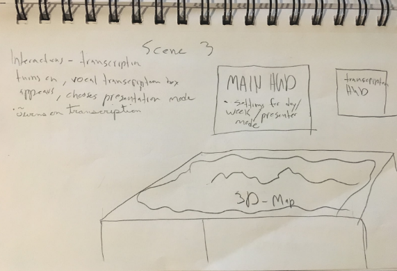
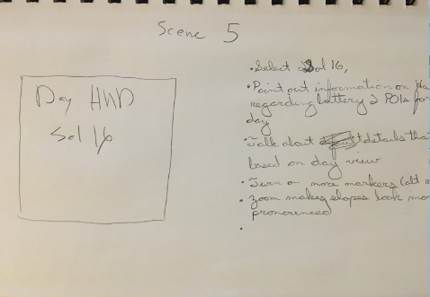
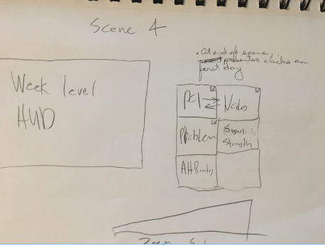
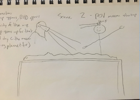
Several scenarios were developed to showcase the ability of the Hololens to storytell the Mars 2020 mission. A series of scenes were fleshed out demonstrating different interactions that could be applied to mission briefing. These included scene’s showcasing the POV of the presenter and observer and of the manipulation of the HUD elements during the briefing.
UX/UI
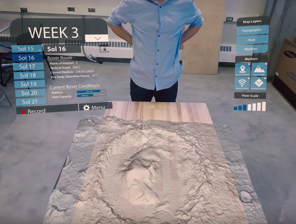
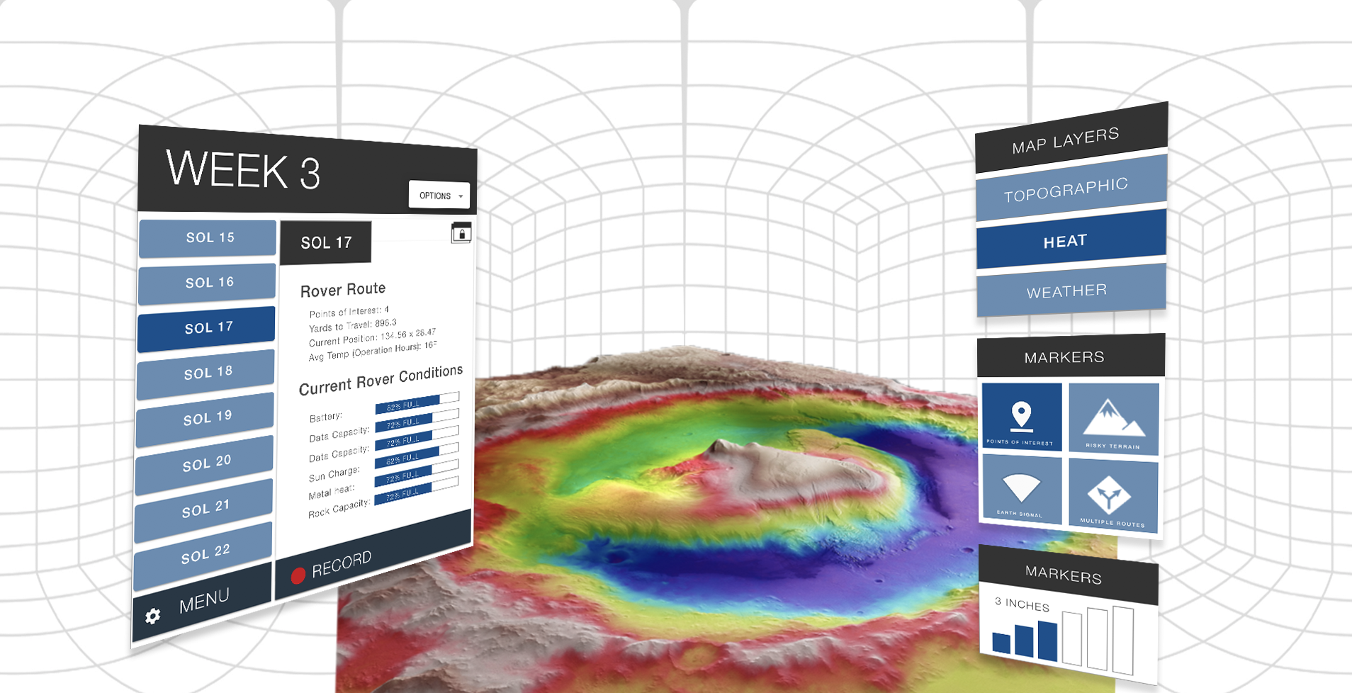
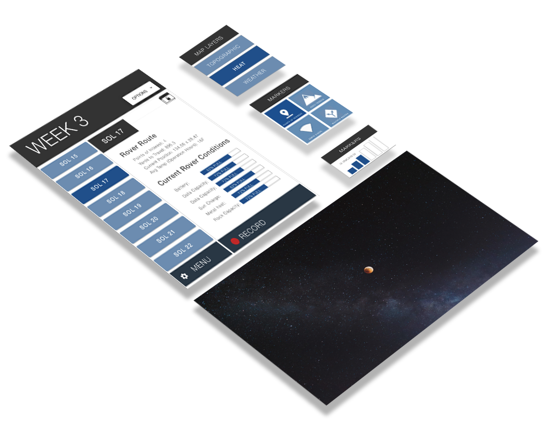
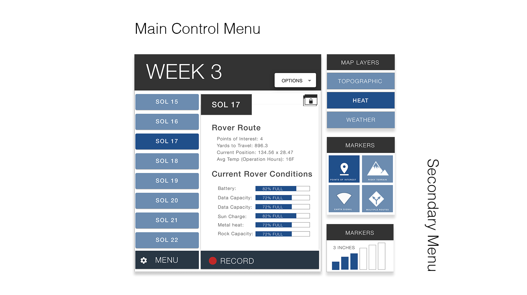
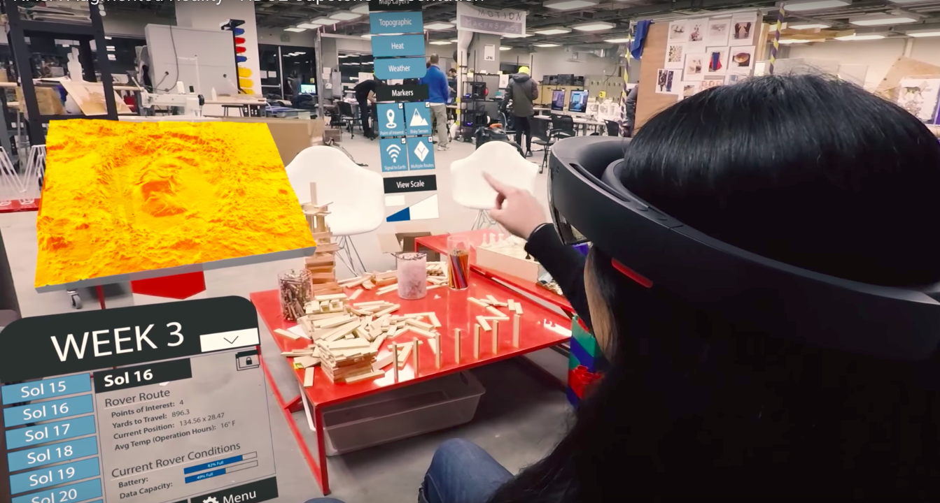
There were several affordances we wanted to offer the user. The main HUD is the user’s focal point to alter the time period the map will display. Once a Sol, or week is selected, essential information necessary for mission planning is displayed including Earth time, as well as information pertaining to the Rover’s current position, battery, and data capacity. Users can additionally pop out this information by clicking on the window pop-out icon in the top-right corner, which will lock this information to the user’s gaze so it is always in view. Users can additionally record and transcribe meetings from the HUD.
The HUD's information presented here grants the user full control of the map visualizations. Layers - Different visual layers can be placed over the map, which are used by JPL to find points of interest, and to plan the rover’s routes. Markers - The markers are different visual markers the user can toggle on/off. View Scale - The z-axis of the graph can be adjusted to provide more or less visual verticality of the map.
Presenter View
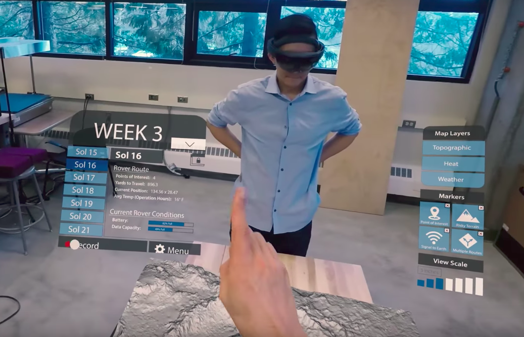
The first interaction showcases the ability of the presenter to turn on the recording for future review. Upon that selection, a HUD appears asking if they would like to have the briefing transcribed into text.The sol (day) view on the left, showcases the Rover’s route and current condition in terms of battery and connectivity. Selection of a different Sol would center the map on the rover’s planned route for that day, as well as supply sol-specific mission information in the HUD. On the right hand side showcases the various filters that can be applied upon Sol selection, such as points of interest, risky terrain, signal to earth and multiple routes.
Map Layer
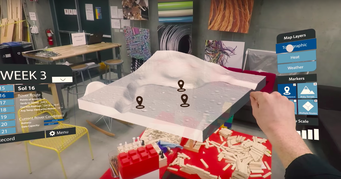
In the application, upon choosing a map layer, the points of interest will automatically appear. They can be deselected if the user would like, and other filters could be added or taken away based upon what the user would like to see during the briefing.The 3D nature of the map gives the viewer a thorough understanding of the topographic areas of interest and what are potential areas of exploration for the future.
Audience View
While users are shown the presenter view during a meeting (e.g. the presenter’s markers, layers, time window), the viewer user can also stray away from the presenter’s information if they would like to investigate something else in the tool.When the spectator would like to return to the presenter view, they are can click on the button in the bottom-left of the HUD to return the map configurations to that of the presenter.
Outcome
Future iterations of the storytelling platform should incorporate data generated through usability testing and heuristics. Participants highlighted the need to focus on specific points of interest, specifically around the z-axis, to better analyze terrain in layers to understand sediment. A tutorial, or some documentation should also be incorporated to help onboard new users. This would include callouts to specific functions and guides to showcase specific gestures. Once these features have been incorporated, the next step will be to code and create a digital prototype that integrates augmented reality devices such as in this project the Microsoft Hololens.
